Thursday, July 9, 2009

Creating a Vintage, Hand-Tinted Look

Day 3 of Jessica Sprague's class was awesome! I am amazed how easy it is to learn from her. I would really encourage anyone who is interested to take a class from her. She offers a wide variety of them from photo editing to digital scrapbooking. Just click here to see what's available.

Now here's my show and tell for Lesson 3--Creating a Vintage, Hand Tinted Look.

This baseball picture of Cam was the first one I tried. Here's before...
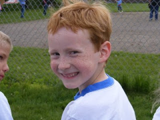


and here's after...
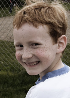
Isn't that so cool! The only hand-tinting on this photo was adding some color to his cheeks. The other changes were all done by adjusting the Hue/Saturation. I also learned how to work with Adjustment Layers.


Here's a black and white photo before...
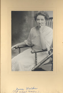


and after...

I did way more hand-tinting on this photo. I tried to keep it subtle, so hopefully you can tell that I tinted her dress green, and added some color to her eyes, lips, and cheeks. Jessica is also great about giving us free downloads such as the black frame. Then she challenged us to add some tiny stars in the background. I'm not sure the stars go with the heritage look, but they are there anyway! :)


Here's the last one I did... before...
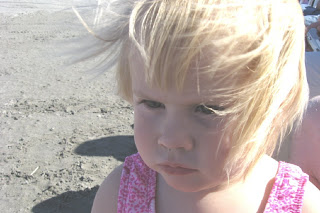

and after...
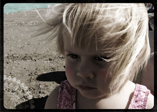
This one turned out pretty dark. I maybe should have worked a little more on the shadow on her face. I had to add some of the white back in her eyes because they turned completely dark. I also added blue water where there really is just sand and again tinted her cheeks. Next I stamped with a brush in the lower left corner. Then I added Jessica's black frame and some tiny stars.

This class is so much fun! It's so nice to learn what all these functions in Photoshop do. I don't think I'll ever be able to scrap a plain old picture again!

Tuesday, July 7, 2009

Scrapping Summer Photos

I seem to take so many photos in the summertime. Maybe it's because we aren't cooped up in the house and spend more time doing fun things. Whatever the reason, more picture taking = more photos to scrap. That's why I love using wallet sized photos on a layout. I can fit a lot into a tiny space and they can tell a fun story.


The boys have taken swimming lessons for the past couple of years. I was especially proud of Taylor, since he had to fight his fear of water the entire way through. I made this layout for him to say how proud I am that he worked so hard despite how unsafe he felt.

I thought this was a great life lesson for him to learn as well as a good reminder for me. Life isn't easy. Many times we want to take the easy way out or ignore a problem. As a mom, I often find myself doing things for the kids and trying to make life easier for them instead of allowing them to experience it for themselves. But we become so much stronger if we do our best and fight our way through the battle. I couldn't jump in that pool and swim for Taylor. He had to do that himself. It was so hard to watch, but he came out of it with more self-confidence and a feeling of accomplishment. Some days I think it's good to have a reminder to "Just Keep Swimming!"


On a lighter note, here is my homework for Day 2 of Jessica Sprague's photo class. We learned how to use digital brushes. She gave us a link to Brusheezy.com. For those of you who are interested, it's a great website where you can download free brushes for personal use.


Now I'm off to practice some more!

Monday, July 6, 2009

Photo Editing Class

Wow! Jessica Sprague is an amazing teacher! I took the first session of her photo editing special effects class today and I learned a lot. I am fairly new to Photoshop and, up to this point, have been VERY overwhelmed. Jessica explains things very clearly and makes this process easy. One thing I loved about the class today was that she only covered a couple of steps. My brain doesn't feel so overloaded that I won't remember what I learned in two days. Today she showed us how to add a frame and word art to a photo. The digital class materials we are using for this class were designed by House of 3. Since I already love the work of the designers there, I've decided the kit is going to be right up my alley!

So here's one of the photos I played around with today. LOVE this yummy frame!


Is anyone else taking this class? If so, let me know. I would love to keep my eye out for your work in the Jessica Sprague gallery.

Thursday, July 2, 2009

Scraplifting

Sometimes I see a layout that I absolutely fall in love with and want one for myself.

I was browsing through the gallery at A Million Memories and saw the most luscious layouts with the new Cosmo Cricket "Early Bird" collection. I came across this one by briarrose86304 that I was in awe of! Since I just happened to have that exact paper sitting on my desk, I decided to re-create one for myself. I really liked how she added all the buttons inside her brackets, but decided not to put them on mine.


Another layout I really liked by Lucy Edson had a painted border around it. I found a die cut paper by Making Memories and traced around the outside edge with a pencil. Then I used a flat brush and some bright red acrylic paint to paint inside the line. I went over it a couple of times but didn't try to make it perfect. The rest of the design is my own:


Once again, the kids were laughing at me as I set up an inanimate object for a photo shoot. But hey, I just HAD to use the funny toaster strip and this idea popped in my head. Why not tell about how much I despise getting up early? Click here to read the journaling.


This layout isn't a scraplift, but I was able to use up some scraps. I was about one year old in this photo and already talking on the phone. I printed the "blah blah blah" text over and over again onto a piece of transparency. Then I cut around it in the same shape as the word bubble and placed it on top. It was a fast and simple layout!

As usual, I am in love with this Early Bird collection. The colors are so bright and old-fashioned. I feel a layout for a class coming on...

Friday, June 26, 2009

Scrapbooking Family History

I love creating heritage pages although sometimes they can be a challenge. I try to find ways to make a layout beautiful as well as record family history. Sometimes there's not a lot of information about a certain person or photo, but I can usually glean little bits here and there.

Patterned Paper: Bo Bunny; Stamps: Inque Boutique; Glimmer Mist: Tattered Angels; Flowers: Bazzill, Prima; Pin: Making Memories; Ribbon: Bazzill

I made this layout for a class I taught at Porter's last night. My great-grandparents are in the large photo in the center. Then the smaller photos are of them and their children...when they are young and then years later. I made a family chart down the left side of the layout starting with my great-grandparents. I thought it was a great way to tie all the pictures together and also give the reader a quick visual of how everyone is related.

The butterfly was made by cutting a pattern from regular paper and attaching it to the layout with temporary adhesive. Then I sprayed Glimmer Mist over that area. After it dried, I removed the mask and there you have it...a beautiful, shimmery accent!

I have a couple of kits left over from class. If anyone is interested, let me know!

Wednesday, June 24, 2009

FREE Photo Editing Class by Jessica Sprague!

Lookie what I just discovered today! I'm definitely going to be giving it a try! Click here to register.


Tuesday, June 23, 2009

Fancy Pants is in da House!!!


I have to admit, the best part about my job at the lss is getting to play with all the new products that come in. (It's a tough job, but somebody has to do it...right)?

The Kraft Kuts line from Fancy Pants arrived just in time for my weekend demo and I think I'm in love! Now I know that I say that about many products, but every once in awhile a collection comes along that completely inspires me. My head fills up with ideas and I feel like I could just keep cranking out the layouts until there's no more paper left. Well, that's how it was with this Fancy Pants collection. I managed to make five 1-page layouts this weekend...that's a record for me!

There's a collection for boys and one for girls, but when I saw them, I realized there was so much potential. I don't think there's a theme you couldn't cover with this stuff (except maybe Christmas). Here's what I made:


Now don't laugh, because these picture are old! I think I was in Jr. High. We were having a party for my sister and acting really silly. But they made me think about all the fun we used to have together as a family (actually, we still do). So I decided to scrap about the overall feeling of happiness and love I remember growing up. The first photo is of my two younger brothers, my sister, and my sister's friend. The second photo is my dad, me, and my sister. And no, our house wasn't pink or purple...it was red. The pictures are just really faded (and maybe the house was a little bit too)!


Some of the sheets of paper were a little busy for me (like the owls). But I really liked it after cutting it into strips. It added a nice splash of color and they are super cute!


This was my first real attempt at editing a picture in Photoshop. I don't know how to do anything fancy, but I did manage to eliminate the hospital cords and whiteboard that was hanging on the wall. I think this photo of my in-laws and their new grandbaby is so sweet!


I LOVE using the shaped papers all by themselves as a background! I printed smaller photos (2 1/2 x 3 1/2) to fit more of them in the small space. This layout is about Cam's school play. He was Velveeta...so cute! I wrote the lines he memorized for the play on the little journaling spots. A simple pocket on the back of the layout makes a great place to store a copy of the program and a newspaper clipping.


This past school year, I decided to do something a little different with the kids' traditional first-day-of-school photos. I took pics of them coming home and documented what their thoughts about the first day were. Here's Taylor's:
  • Find out what's new with old friends.
  • Try not to be tardy for every class.
  • School lunch is still gross.
  • Too much to remember!
I really lucked out that there happened to be a #7 in the perfect spot of this patterned paper. I lightly traced a circle around it with a pencil. Then I used my sewing machine to stitch around the circle three or four times. It made a great, inexpensive accent and reinforced the "7th Grade" theme.

So there you have it. I could have made more, but I decided I should sleep a little too. For more fabulous ideas, visit the Fancy Pants Gallery.

Happy Scrapping!