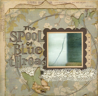
It's official! I am totally in love with this collection! Life Stories by My Mind's Eye is all printed on kraft cardstock making for muted tones and an all around vintage look. There is a blue collection and a pink/red collection. I can't tell which is my favorite...I love them both!
Here's a story I've been wanting to document for a long time. When I was small I accidentally "stole" a spool of blue thread from a fabric store. After playing in a large bin filled with colorful spools, I didn't realize I still had it in my hand when we left. This is the story of the life lesson I learned from that experience.
 Photo courtesy of lepiaf.geo on Flickr.
 I got pretty messy with all of these layouts. For the title, I painted Tim Holtz grungeboard letters with crackle paint and then inked over them with dark brown.
 I sponged blue and green distress inks onto the grungeboard butterflies, then finished them off with a spritz of Pearl Glimmer Mist.
 I love making hidden journaling on a layout, especially if I have a lot to say. ;)
I saw the basic design for this next layout somewhere and now I can't figure out where it came from. (I think it was somewhere in the 2 Peas gallery). If anyone knows, please tell me so I can give them credit.
 For my tree, I punched various sizes of circles from plain white tissue paper and sprayed them with Olive Vine Glimmer Mist. When I dried them with my heat gun, they kind of crinkled up, especially around the edges. Some of the circles were hit directly with the Glimmer Mist and show a gold shimmer. The colors soaked through to others when they were layered together which gave them a little different look. I think they turned out great! I attached each "leaf" with a tiny dab of Diamond Glaze.
 The tree trunk was cut from a recycled piece of cardboard. I sprayed everything with an acid-neutralizer when I was all done.
This next project is a class I designed for Porter's.
 These are a few of my girls who attend our scrapbook classes regularly. Some have been coming for as long as I've been teaching there (7-8 years?? I've lost count!). The idea for this layout was inspired by this video that I thought was way cool.
I've decided that Tim Holtz products work fabulously with this collection! The flowers were die cut from grunge paper. Then I colored them with a variety of alcohol inks, curled the edges, and added tiny beads to the centers. Check out Tim's beautiful grunge paper flowers here.
 I tried cutting out paper dolls the old-fashioned way, but it was way too hard because they were so small. Then I discovered these cute little stamps by Autumn Leaves. Each girl is stamped individually onto patterned paper with...you guessed it...Tim Holtz Distress Inks. Then I cut around the entire row by hand.
Thanks for looking! I have another project I will post tomorrow.


I just bought some of this line... LOVE IT... haven't used it yet, but it's so pretty!
ReplyDelete