Showing posts with label Photos. Show all posts

Monday, May 16, 2011

Photogenic Family

My niece and her family are so photogenic!  I swiped these pics from their blog and added them to my latest class kit for Lucky Lark Designs.  They dragged her mother's settee across the street to the park (which I think makes a wonderful setting for some family photos).  Love it! 

 I'm in love with these "Bloomer" style flowers.  They are so soft and feminine and make a wonderful accent on a page.  And after being squished in a sheet protector, they still just pop right back up.  :)

I heat embossed the "Family" title with black powder as well as a couple of other accents of the page.  I've had the Scenic Route papers around for awhile just waiting to create something with them.  They are so bright and pretty and remind me of summer.  (I *think* I remember what summer is like...)

Thanks for looking!  I have some fun Echo Park layouts I've been working on and need to get them posted soon.

Tuesday, July 6, 2010

Photo Ideas-Road Trip

Going on a road trip this summer? Becky Higgins has some great suggestions for some fun photos you can take to document the experience. Check it out here.

Photo courtesy of The Tahoe Guy on Flickr.

Sunday, November 8, 2009

28 Photos!

I've been working on this fun Christmas layout and trying to find a way to put lots of pictures on one page. (I can't be the only one out there who takes a bazillion photos during the holidays, right)? If I counted right, there's 28 pictures on this layout altogether! How do you ask? Well read on...


I started out with little 2x3 photos (Read my last post to find out an economical way to print this many pictures). I created a grid that spanned a two-page layout and filled in the space with 2x3 bits of patterned papers as well as my photos. Then I created a large flap that lifts up to reveal even more!

I was able to showcase everyone in the family this way. It was a lot of work, but I love how it turned out! I used the new Christmas collection by My Mind's Eye and the matching die cut page turned out to be really handy. It included the journaling blocks, title, and little punch-out embellishments that I could fill in empty spaces with. I also used stamps, QuicKutz dies and other flat embellishments. Ultimately, I ended up with lots of journaling space, lots of photo space, and lots of places to embellish. What more could a scrapper ask for? :)

This type of layout would work great for any event where you take lots of pictures or want to summarize a period of time. Think "Year in Review," school, or holiday themes.

Saturday, October 24, 2009

Photo Cropping Made Easy

I love creating "Gratitude" layouts. Even though the things I'm grateful for stay pretty constant from year to year, I think it's fun coming up with new ways to express them.

This layout was inspired by the phrase "Counting my Blessings." I thought it would be fun to substitute falling leaves with numbers to symbolize the abundance of blessings we receive each year. I also wanted a way to include lots of pictures on the page but keep the layout linear. My solution came in the form of 2" x 6" photos. This way I was able to add 7 photos without overwhelming the overall feel of the layout. I left one photo in color, because I wanted to showcase the beautiful autumn colors as well as the temple, and changed all the rest to black and white.

Papers: Pebbles; Dies: QuicKutz; Stamps: American Crafts, Hampton Art; Border Punch: Fiskars; Cork: QuicKutz; Other: felt, buttons, pins, ribbon.

PHOTO TECHNIQUE:
While reading through the September 2009 issue of Creating Keepsakes, I ran across an article by Jessica Sprague about a cool technique for getting multiple photos on one 4x6 print. She taught how to create six 2x2 photos on one print and I used the same technique to get two 2x6 photos on one print. I have looked all over the internet for a link to this and haven't been able to find one. So I will share with you how it's done. Please keep in mind that I am NOT a Photoshop expert at all, but this is what worked for me. (This tutorial came straight from the Creating Keepsakes magazine...I have just changed the dimensions to create the photos for this particular layout).

1. Open two photos. Go to File>New>Blank File to create a new document. Set it to 4" wide, 6" tall and 300 pixels per inch. Click OK.
2. Double-click on your first photo in the Project Bin to switch to it. Select the Crop Tool. In the Options bar at the top of your screen, type 2" for the width, 6" for the height and 300 pixels/inch for the resolution. Click and drag over your photo to select a crop area. Double-click inside the selection to commit.
3. Select the Move Tool. Click and drag the cropped photo down onto the thumbnail of your new document in the Project Bin at the bottom of your screen. When Photoshop Elements switches over to your blank document, click and drag your photo to position it as desired. Repeat steps 2 and 3 for each photo.


This is what your 4x6 print will look like when you are done. Simply cut them apart to attach the photos to your layout.

I love using this technique for printing wallet-sized photos as well. It's a real money saver and takes the guess work out of cropping manually. Give it a try!

Wednesday, July 29, 2009

WordArt

Check out this fun WordArt website I discovered for adding cute accents to layouts, photos, or documents. In the Photoshop class I took from JessicaSprague.com, we added WordArt of our own to photos. Here are a few examples:


It adds a unique touch to a special photo. I especially love the ampersand which came from the Porcelain font you can find here. Here's some more font favorites which I used in these photos...Karabine and Adler.

I think these photos would be fun to frame and give as gifts.

Sunday, July 12, 2009

Photoshop Textures

Holy cow! I am having so much fun! Taylor has been learning these photoshop classes right along side me. He learns faster than me, I think, but together we get it all figured out. I've been a little behind on the classes, so today I caught up on Days 5, 6, and 7.

Day 5 was learning how to use Textures. Seriously, how can I ever print a normal picture again? There are the coolest textures and brushes...well basically EVERYTHING you could imagine out there is cyberspace for free or for sale. And I am IN LOVE with textures!

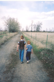
Here's what Taylor and I came up with together on this photo of him and his little brother...

BEFORE:
AFTER:
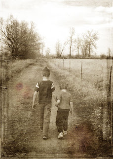
Is that cool or what??? I started out by changing the photo to black and white (yes, black an white!) and then adding 3 textures over the top of each other. Lost and Taken is a great website to download free textures.

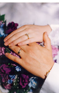
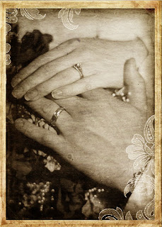
Here's another with the addition of a frame designed by Jessica Sprague...

BEFORE:

AFTER:


Then I just started playing around and having fun with brushes AND textures (I know, wild, isn't it!) :)

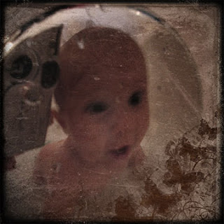
This was kind of a funky photo to start with. My brother took a picture of his son looking at his reflection in the faucet of the bathtub. All the better to grunge it up, right? I downloaded a whole bunch of cool brushes from here. That's where the butterflies and corner came from.


Text brushes are one of my new favorites...

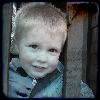
Oh! I nearly forgot...Have you ever heard of TTV or Through the Viewfinder? I hadn't until taking this class. Photographers take a photo with their camera pointed through the viewfinder of a 2nd old camera to get the cool "distorted, square with black edges and rounded corners look." Check out this Flickr group to see what I mean. For those of us who would like to take the easy way out, there's a texture for that. Oh yeah! The two photos above use some TTV textures that Jessica found on Flickr for us.


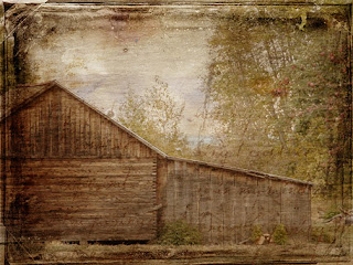
I saved the best picture for last. (At least in my opinion). I snapped this photo at my Grandparent's place at the lake. I desaturated the color, then added 3 texture layers. I hand-tinted the part of the lake back in that was peeking out of the trees. Next I added some text brushes in the bottom corners. It sounds like a lot of work, but it only took me about 5 minutes.

So am I a geek or what? I feel like I'm the last person to learn Photoshop, so I'm probably telling you all something you already know. I'm just exited that I'm finally learning something! Thanks for letting me share!

Friday, July 10, 2009

Adding Clipping Masks and a Fishing Layout

If you've been reading my previous posts, you will know about the Photoshop class I'm taking at JessicaSprague.com. Day 4 was how to use Clipping Masks. It was a fairly simple lesson. I only did one photo because I had to go teach my class...notice the grungy border?

And here it is on a layout.

I used the "Breaking Free" paper from My Mind's Eye for this layout and self-adhesive cork from QuicKutz. I finally got to use my new Binding Edge punch by EK Success. (We've been waiting for them to come in at Porter's for months!). The punch looks like the edge of a notebook paper. Love, love, love it!
The cool thing about these border punches is they have a little lock so they will store flat. It saves so much room! You should check them out!

Anyway, I'm a day behind in my photoshop lessons, so I better get busy!

Thursday, July 9, 2009

Creating a Vintage, Hand-Tinted Look

Day 3 of Jessica Sprague's class was awesome! I am amazed how easy it is to learn from her. I would really encourage anyone who is interested to take a class from her. She offers a wide variety of them from photo editing to digital scrapbooking. Just click here to see what's available.

Now here's my show and tell for Lesson 3--Creating a Vintage, Hand Tinted Look.

This baseball picture of Cam was the first one I tried. Here's before...


and here's after...

Isn't that so cool! The only hand-tinting on this photo was adding some color to his cheeks. The other changes were all done by adjusting the Hue/Saturation. I also learned how to work with Adjustment Layers.


Here's a black and white photo before...


and after...

I did way more hand-tinting on this photo. I tried to keep it subtle, so hopefully you can tell that I tinted her dress green, and added some color to her eyes, lips, and cheeks. Jessica is also great about giving us free downloads such as the black frame. Then she challenged us to add some tiny stars in the background. I'm not sure the stars go with the heritage look, but they are there anyway! :)


Here's the last one I did... before...


and after...

This one turned out pretty dark. I maybe should have worked a little more on the shadow on her face. I had to add some of the white back in her eyes because they turned completely dark. I also added blue water where there really is just sand and again tinted her cheeks. Next I stamped with a brush in the lower left corner. Then I added Jessica's black frame and some tiny stars.

This class is so much fun! It's so nice to learn what all these functions in Photoshop do. I don't think I'll ever be able to scrap a plain old picture again!

Tuesday, July 7, 2009

Scrapping Summer Photos

I seem to take so many photos in the summertime. Maybe it's because we aren't cooped up in the house and spend more time doing fun things. Whatever the reason, more picture taking = more photos to scrap. That's why I love using wallet sized photos on a layout. I can fit a lot into a tiny space and they can tell a fun story.


The boys have taken swimming lessons for the past couple of years. I was especially proud of Taylor, since he had to fight his fear of water the entire way through. I made this layout for him to say how proud I am that he worked so hard despite how unsafe he felt.

I thought this was a great life lesson for him to learn as well as a good reminder for me. Life isn't easy. Many times we want to take the easy way out or ignore a problem. As a mom, I often find myself doing things for the kids and trying to make life easier for them instead of allowing them to experience it for themselves. But we become so much stronger if we do our best and fight our way through the battle. I couldn't jump in that pool and swim for Taylor. He had to do that himself. It was so hard to watch, but he came out of it with more self-confidence and a feeling of accomplishment. Some days I think it's good to have a reminder to "Just Keep Swimming!"


On a lighter note, here is my homework for Day 2 of Jessica Sprague's photo class. We learned how to use digital brushes. She gave us a link to Brusheezy.com. For those of you who are interested, it's a great website where you can download free brushes for personal use.


Now I'm off to practice some more!

Monday, July 6, 2009

Photo Editing Class

Wow! Jessica Sprague is an amazing teacher! I took the first session of her photo editing special effects class today and I learned a lot. I am fairly new to Photoshop and, up to this point, have been VERY overwhelmed. Jessica explains things very clearly and makes this process easy. One thing I loved about the class today was that she only covered a couple of steps. My brain doesn't feel so overloaded that I won't remember what I learned in two days. Today she showed us how to add a frame and word art to a photo. The digital class materials we are using for this class were designed by House of 3. Since I already love the work of the designers there, I've decided the kit is going to be right up my alley!

So here's one of the photos I played around with today. LOVE this yummy frame!


Is anyone else taking this class? If so, let me know. I would love to keep my eye out for your work in the Jessica Sprague gallery.

Wednesday, June 24, 2009

FREE Photo Editing Class by Jessica Sprague!

Lookie what I just discovered today! I'm definitely going to be giving it a try! Click here to register.